
This project is still working in progress.
Some interfaces may not work / change in the future.
Use it as your own risk.
⛏️ (Probably) Full Kotlin support for Kyori Adventure.
❗ Notice
For Paper platform, you have two plugins to download: bundle and spacefree.
bundle ver. will shade kotlin stdlib into the plugin, and spacefree ver. will download kotlin stdlib with library loader provided by paper.
For Velocity platform, only bundle ver. is provided because Velocity doesn't provide any way to download dependency from maven repository.
🤔 Goal
Since Kotlin brought us the ability to create Extensions, we can create DSLs.
This project aimed to create many DSL utilities for adventure's builder pattern API, which make your life easier.
📦 Artifacts
Repository
repositories {
    maven(uri("https://maven.nostal.ink/repository/maven-public/"))
}
Dependency
dependencies {
    // Use shadowJar to shade the artifact into your jar
    // or use standalone paper plugin provided on Modrinth (you are right here!)
    api("plutoproject.adventurekt:core:2.1.1")
}

// If you want to shade this project, we recommend that relocate package to yours.
tasks.shadowJar {
    relocate("plutoproject.adventurekt", "com.example.libs.adventurekt")
}
☕ Usage
Creating a component
You can create components with component function simply.
val component: Component = component {
    text("This is a text component, nothing special.") // simply create a component
    text { "Text component here" } // lambda with return
    translatable { "gui.ok" } // use locale related string
    keybind { "key.inventory" } // use keybinds related string
    raw { Component.text("text") } // use adventure component directly
    mini("<red>mini message!") // use mini message
    newline() // line break
    space() // just a " "
    empty() // nothing
}
If you want to use adventure-kt to build lore for Minecraft items, you can use componentList function.
val components: List<Component> = componentList {
    text { "first line" }
    text { "second line" }
}
ItemLore.lore(components)
Applying styles
You can use with keyword to add a style and without keyword to remove a style.
All the styles connected with and after a with keyword will all be considered as with styles.
Otherwise, all the styles connected with and after without keyword will all be considered as without styles.
Also, you can use old styles from v1 like directly connect all styles with just with or without keyword.
component {
    // due to shadow colors is customizable, color now split into text types and shadow types
    // simply add text and shadow in front of colors to use color types in advkt v2
    text("text") with textRed and shadowBlack without italic and color // nothing changed at result because "without color" is the latest step
    text("text") with underlined with textAqua with runCommand("/say hello") // with "underlined" decoration, "aqua" text color and "run command" click event

    // after 2.1.0, adventure kt added a simplier usage for color
    text("text") with red.text
}
If you are afraid of causing ambiguity, you can use style name to add styles.
component {
    text("text") color red.text deco underlind undeco italic // with red text color, underlined decoration and without italic decoration
    text("text") color null shadow blue.shadow // use null to remove colors, use shadow to apply shadow colors
}
If you have used ArkUI or SwiftUI, you can use functions after component to add styles.
component {
    text("text")
        .color(red.text)
        .decoration(italic, false)
}
After 2.1.0, you can use style function to create a reusable style or to apply styles more obviously.
val generalStyle = style {
    textColor("#66ccff")
    shadowColor(green)
    decoration(underlined)
    undecoration(italic)
}

component {
    text("text") provide generalStyle

    // or just
    text("text") provide style {
        textColor("#66ccff")
        shadowColor(green)
        decoration(underlined)
        undecoration(italic)
    }
}
Click & Hover events
Just like styles, you can apply click events and hover events with keywords with and without.
component {
    text("text") with /* click event */ runCommand() with /* hover event */ showText {
        text("hover text!")
    }
Modifying MiniMessage
You may have needs to change MiniMessage object when add MiniMessage strings, you can modify component mini message object.
component {
    miniMessage {
        strict()
        tags {
            tag("aa", Tag.inserting(Component.text("aa")))
        }

        // you can also deliver a MiniMessage object to builder
        provide(MiniMessage.miniMessage())
    }
}
When add MiniMessage texts, you can modify when adding texts.
component {
    mini("<red> Welcome, <name>, <events>") {
        target(audience)

        unparsedPlaceholder("name", "DeeChael")
        componentPlaceholder("events") {
            text("No events here!")
        }
    }
}
Overriding actions
You can override some actions for better usage.
component {
    actions {
        newlineAction {
            // do sth
            it.container // ComponentKt object, which is the component builder of adventure-kt
            it.value // Component? object, set it to null and builder will not append this component, or set to other component to add the component you want
        }
        spaceAction {
            // do sth
        }
        emptyAction {
            // do sth
        }
    }
}
For example, to make use of newline component to create a list of components instead of use linebreak
fun lore(content: ComponentKt.() -> Unit): ItemLore {
    val components = mutableListOf<Component>()
    val last = component {
        actions {
            newlineAction {
                components.add(it.cleanBuild())
            }
        }
        content()
    }
    components.add(last)
    return ItemLore.lore(components)
}
After 2.1.0, the example above can be replaced with componentList function.
fun lore(content: ComponentKt.() -> Unit): ItemLore {
    return ItemLore.lore(componentList(content))
}
Creating a title (WIP for v2)
title {
    mainTitle {
        text("This is a main title.")
    }
    subTitle {
        text("This is a sub title.")
    }
    // support both Kotlin duration and Java duration
    times {
        fadeIn(1.seconds)
        stay(1.seconds)
        fadeOut(1.seconds)
    }
}
Full usage example
Screenshot
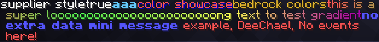
Code
component {
        miniMessage {
            strict()
            tags {
                tag("aa", Tag.inserting(Component.text("aa")))
            }
            provide(MiniMessage.miniMessage()) // highest priority
        }

        actions {

            newlineAction {
                it.value = null // clear the original component
            }

        }

        replacements {
            override()
            replacement {
                once()
                matchLiteral("fuck")
                replace {
                    space()
                    text("****") with textRed and underlined
                    space()
                }
            }
        }

        text { "supplier style" }
        text { true }
        text("aaa") with "#66ccff" and bold and strikethrough without italic and strikethrough
        text("color showcase") with textRed with shadowDarkBlue
        text("bedrock colors") with textMaterialGold

        text("this is a super looooooooooooooooooooooong text to test gradient") with textGradient(red, green, yellow, darkPurple)

        // use component default mini message
        mini("<blue><bold>no extra data mini message")

        // use default mini message with custom placeholder and other things
        mini("<red> example, <name>, <events>") {
            unparsedPlaceholder("name", "DeeChael")
            componentPlaceholder("events") {
                text("No events here!")
            }
        }
    }
90% of ad revenue goes to creators
Support creators and Modrinth ad-free with Modrinth+